The world of book publishing has changed with the advent of online publishers like Amazon and Smashwords. Those of us reared in the old school of agent/publisher/bookstore have to rethink our method of distribution.
Part of the online distribution involves attracting potential customers with an attractive, alluring book cover. Traditional book publishers have teams of artists that know what will sell, what will appeal to which audience.
When you shift the publishing burden onto your own shoulders, YOU are that team of artists.
A few caveats: first, and most important – I have every intention of getting this book published through traditional means. My sincerest hope is that one of the Big Five will like it and pick it up and one of these days I’ll be in a Barnes and Noble, and, hey, that’s ME!
Another caveat: I am no graphic artist. I’m a pretty good technical illustrator, but fine art and I are distant cousins at best.
Final caveat: this is not the final cover.
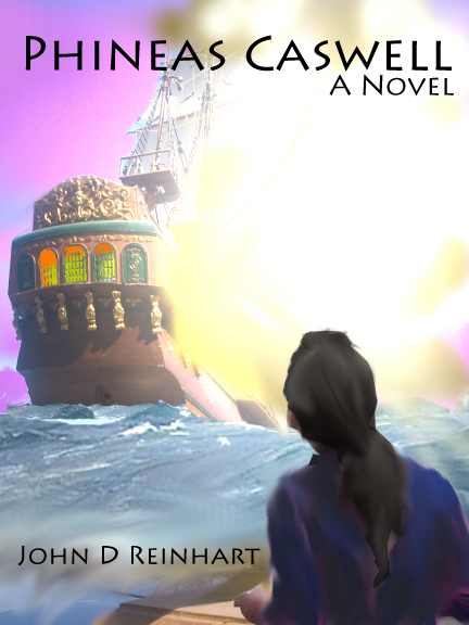
All that being said, the reason I’m presenting this cover here is to show you what can be done cheaply and on the slick. The ship is a 1/72 scale model, The Black Swan, by a Russian company called Zvezda. It’s not quite done yet. In fact, she’s the same ship as in the masthead of this site.
I lifted the ocean from a painting of an American frigate – I don’t think it was in the public domain, but I’m using so little of the painting I think the artist, who is probably long dead, would be able to identify his fine, fine artwork.
Phineas, here with longer hair than in the story, is actually my daughter. The image was lifted out of a shot of her and her mom at the Mission San Gabriel two years ago. I thought the pose was right, and, well, at ten years old, she didn’t have a female shape yet, so she could pass for a boy.
The pieces were all assembled in GIMP, a free image manipulation program available at GIMP.Org. Once I got the image blended to where I liked it, I exported it as a JPG file. Then I opened the JPG with my old Illustrator 2.o, added the titles (which are in a font called Lithos Pro) and exported the completed file as a PNG. I remember someone telling me that size is important in graphics, so I sized the PNG at 8 inches tall and 6 inches wide.
So, it’s not the final cover art, but it’s a good first shot. I’m hoping I won’t have to use it or its cousins because a major publisher and their team of artists will take over all of that.
Still, it’s amazing what you can do with a few easy graphic pieces, some software, and a couple of hours.
